Project Summary
This project uses Power BI to convert data from the “Best Buy Reports Fiscal Third Quarter Results” PDF into a set of visual displays. The goals include illustrating changes in sales by product category and region, identifying revenue trends across multiple fiscal quarters, showing the distribution of sales by category, and presenting key performance measures such as earnings per share.
Process
The initial step involves extracting figures from the PDF and converting them into a structured dataset. The data is cleaned to ensure consistent categories and time periods. The dataset is loaded into Power BI, where queries and relationships are defined. DAX measures are created to support calculations for metrics and comparisons over time.
Tools
The primary tool is Power BI Desktop. Excel is used for initial data structuring and formatting. DAX is used within Power BI for calculations and measures.
Final Outcomes
The final dashboard includes a bar chart comparing domestic and international sales changes by category, a line chart showing revenue across four fiscal quarters, a pie chart displaying the share of sales by category, and a KPI that shows earnings per share. Filters and hover tooltips allow users to focus on subsets of the data and view details on demand. The result is a data-driven view that supports decision-making based on changes in performance, distribution of revenue sources, and financial measures. This approach can be adapted to additional datasets or extended with methods such as forecasting or competitor benchmarking. It provides a reference for exploring business performance through a combination of structured data, relational modeling, and visualization.
Power BI style mockup on Best Buy fiscal market
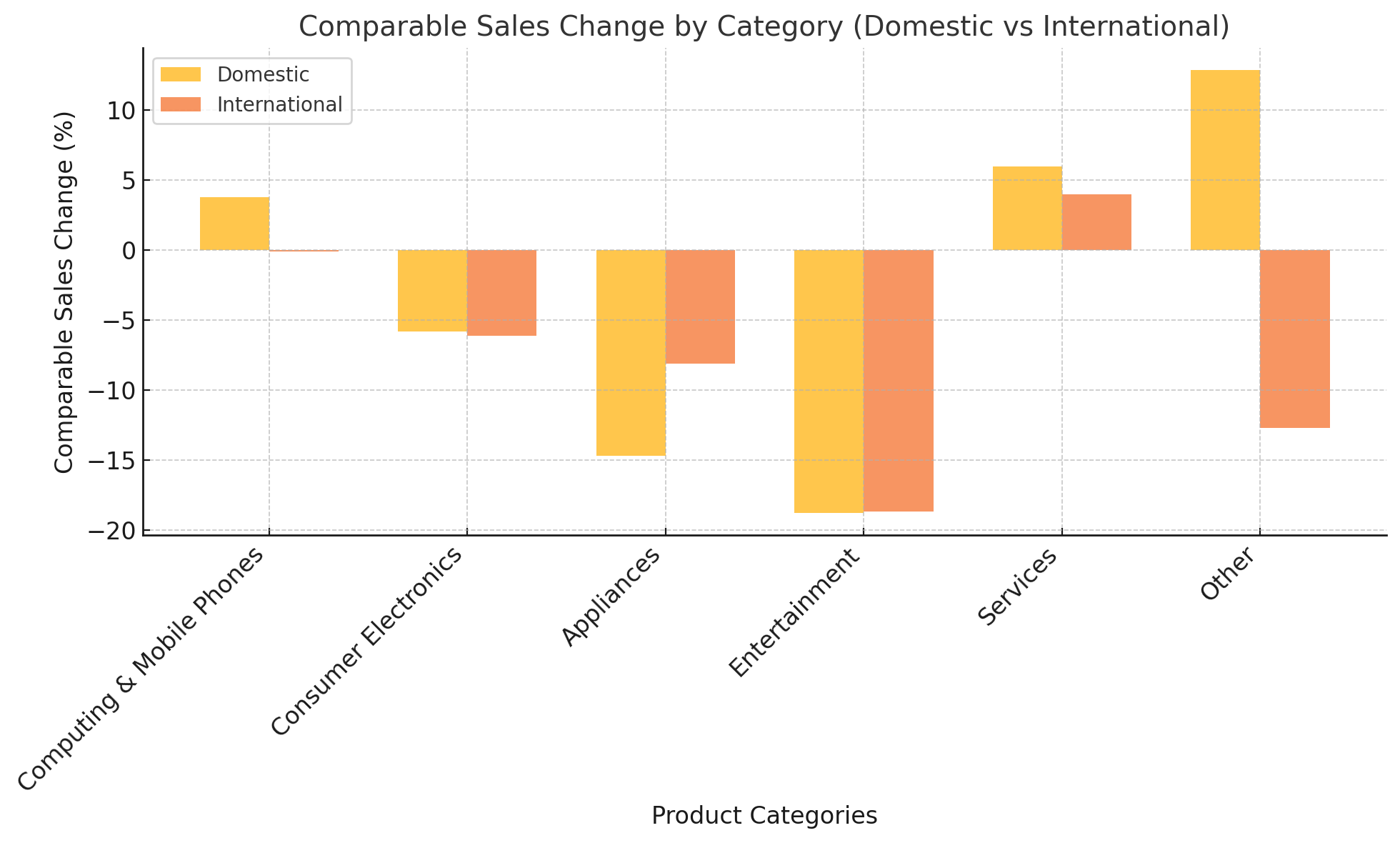
A visual representation of sales data designed to analyze and communicate key trends in Best Buy's third-quarter performance. It includes four key visualizations: a bar chart comparing domestic and international sales changes across categories like Computing, Electronics, and Appliances; a line chart showing revenue trends across four fiscal quarters; a pie chart illustrating the percentage distribution of sales by product category; and a text-based KPI display for Earnings Per Share (EPS). These elements work together to highlight areas of growth and decline, revenue trends over time, and overall sales distribution, providing insights into the company's performance. This approach mimics what a Power BI dashboard would present, making it relevant for portfolio purposes.
Revenue Trend Analysis Over Multiple Quarters
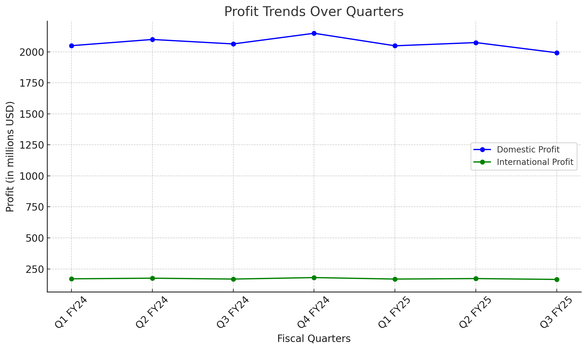
I created this chart to show profit trends over several quarters for domestic and international segments. Domestic profit is represented in blue, and international profit is represented in green. The chart highlights how profits have changed over time, showing differences between the two segments. Profit trends indicate how well the company is managing its costs relative to revenue, where domestic or international operations may face challenges, and whether there are seasonal patterns or shifts in profitability. The trends also reflect the impact of cost management, operational decisions, and market conditions on the company’s financial performance.
Best Buy CO. Category Revenue
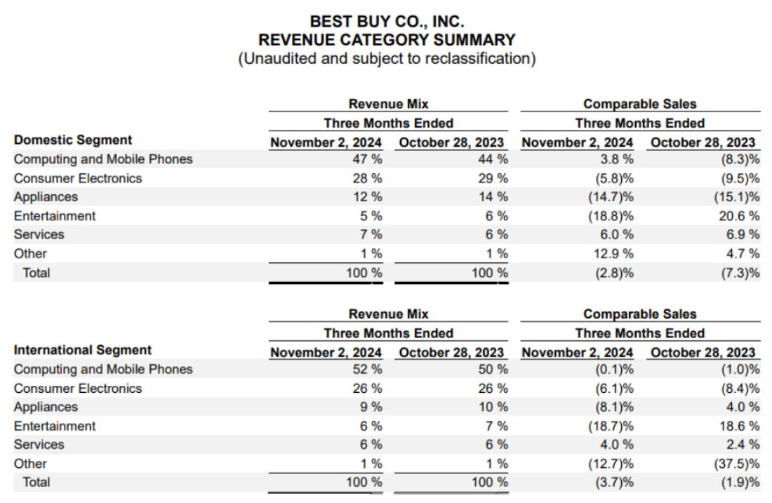
This table from Best Buy's Fiscal Third Quarter Results provides a breakdown of revenue mix and comparable sales changes by category for domestic and international segments, including Computing and Mobile Phones, Consumer Electronics, Appliances, Entertainment, Services, and Other. The data was extracted from the report, processed to address formatting issues, and imported into Power BI for visualization. It was used to create bar charts comparing domestic and international sales changes, pie charts showing revenue mix by category, and trend analyses to support decision-making. The visualizations provide insights into category performance and inform planning decisions for product lines in different markets.