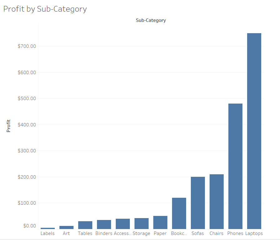
Mockup Retail Sales Analytics Dashboard Using Tableau
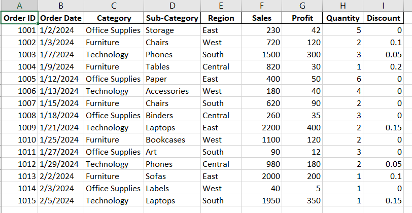
Sales Over Time (Line Chart)
This Sales Over Time Line Chart shows how sales vary from day to day and helps identify patterns or unusual changes in performance. The purpose of this case is to figure out which days have high sales, like $2,200 on 1/21/2024, and which days have lower sales, like $40 on 2/3/2024, so the business can understand what might be influencing these results. This chart helps the business focus on days that are performing well to replicate that success and look at ways to improve on slower days. It can guide decisions like when to run promotions, restock inventory, or adjust marketing strategies to maintain or grow sales. Using this information allows the business to track trends and make informed plans to improve performance over time.
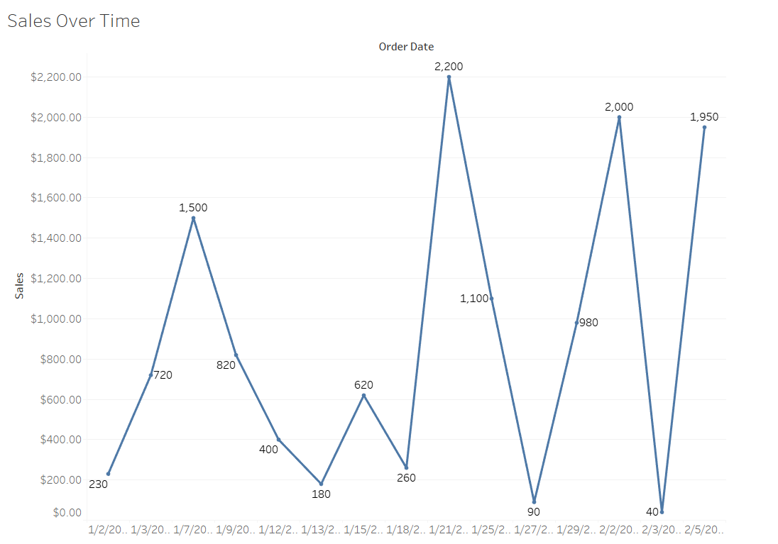
Sales by Region and Category (stacked bar)
This Sales by Region and Category Stacked Bar Chart looks at how sales are divided across regions and product categories to help understand where the business is performing well and where there is room for growth. The goal of this is to compare sales in different regions and see which product categories are contributing the most or least to overall revenue. For example, one region might have high sales in a certain category, while another might lag behind, showing opportunities to improve. This chart also makes it easier to spot trends, like which regions consistently perform better or which categories might need more attention. By analyzing these patterns, decisions can be made about where to focus marketing, how to manage inventory, or where to direct more resources. It shows how data can be used to guide business strategies and improve overall performance.
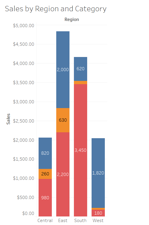
Profit by Sub-Category
This Profit by Sub-Category Bar Chart looks at which product sub-categories are generating the most profit and which ones might not be performing as well. The goal is to compare profits across all sub-categories to figure out where the business is doing well and where changes might be needed. For example, if some sub-categories are making high profits, the business could focus more on promoting those products, while lower-performing sub-categories might need adjustments in pricing or marketing strategies. This chart helps break down profitability in a clear way so the business can prioritize efforts, make smarter financial decisions, and ensure resources are being used effectively. By using this data, the business can plan better and work toward improving overall profitability.